ISO: 200
Aperture: f/2.6
Shutter Speed: 1/8 seconds
In this photo assignment, I chose to shoot Still Life. Still Life is when you shoot a picture of something that is set up for the picture. This is our last photo assignment, and I had fun shooting it.
Monday, November 22, 2010
Monday, November 15, 2010
Portrait
In this photo assignment, I chose to shoot Portrait. I used the techniques that we learned while shooting the portrait demo. I used a window for the key light, and then a poster board for the fill light to reduce shadows.
ISO: 200
Aperture: f/2.6
Shutter Speed: 1/60
Thursday, November 11, 2010
School Context
In this project, I took a picture of something you would see everyday and changed it into something unexpected. I took a picture of water bottles in a vending machine, and then I put pictures of insects from the internet onto the picture using the editor called Gimp. I used techniques that I have already learned to create this picture, so I didn't have to learn anything new.
Monday, November 8, 2010
Light Painting
ISO: 100
Shutter Speed: 15 seconds
Aperture: f/2.6
In this photo assignment, I chose to shoot Light Painting. Light Painting is when you set the shutter speed to the lowest it can go in a dark room, and then you use a source of light to "paint". This picture was taken in the studio at our school, and I set the shutter speed to 15 seconds. I set the camera on a stool and stood behind her with glow sticks and waved them around. I had a lot of fun shooting this assignment, and this picture was the best out of all the Light Painting ones I took.
Thursday, November 4, 2010
Portrait Demo
In this project, we learned how to take a good quality portrait picture. We took one in the studio, and one next to a window. To take a good portrait picture, you need 3 sources of light. They are called the key light, fill light, and a hair light. The key light is the main source of light, and on the side of the subject. The fill light is on the opposite side, and that is used to reduce shadows created by the key light. The hair light is placed behind the subject, and it is somewhat dim. In the studio we had all of these lights for us to use. But in the window picture, the light from the window was the key light. For the fill light, we had to use a white poster board as an alternative. We then combined the two pictures in one on Gimp. I learned a lot in this demo, and it was fun.
Monday, November 1, 2010
Black and White

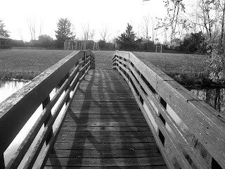
In this photo assignment, I chose to shoot Black and White. This picture was taken in a park by my house. there is a pond under a bridge, and I thought it would be a pretty picture. I like how the bridge creates a sense of lines and shadows. I like this picture, and this one best displayed my abilities of Black and White.
ISO: 80
Aperture: f/4
Shutter Speed: 1/250
Friday, October 29, 2010
Panoramic
In this picture, we were practicing panoramic pictures. We took 3 pictures with a 10-20% overlap between them. We then used the online editor called Gimp to put them together seamlessly. When I first aligned them together, there was a distinct line between the pictures. So to eliminate this, I used the eraser tool in Gimp to make it blend together better. This was a good experience because it taught us more about GImp and how it works.
Monday, October 25, 2010
Animals
In this photo assignment, I chose to do Animals. I took pictures of my cat, and I thought this one best displayed Animals. This picture was taken outside in my backyard, and I had fun shooting this photo assignment.
ISO: 80
Aperture: f/5
Shutter Speed: 1/60
Wednesday, October 20, 2010
Retouch Assignment
In this assignment, we were given a picture of a car that needed retouching. The picture was taken by a student two years ago, and Mr. Bush let us use it to practice retouching. We changed the background to black, so it was less distracting. We also got rid of the glare on the car so it looked nicer. I learned a lot from this assignment, and it was very helpful.
Monday, October 18, 2010
Nature
In this photo assignment, I chose to do Nature. This picture best displayed Nature out of all the ones I took. This time of year I thought would be best to shoot a Nature picture because the trees are changing color and it is pretty outside.
ISO: 80
Aperture: f/4
Shutter Speed: 1/400
Thursday, October 14, 2010
Motion Demo
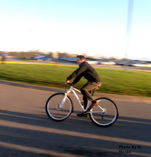
In this assignment, we experienced panning. This is when you have an object that is moving, and you follow the motion with your camera. The object is supposed to be clear, and the background should be a bit blurry. After taking the pictures, we edited them in an editor called Gimp. There we changed the brightness of the picture.
Monday, October 11, 2010
Macro
In this photo assignment, I chose to do Macro. Macro is used to take a close up picture, and this specific picture was taken of a flower in my backyard. I learned that you can't get too close to the object, or it will get blurry. Instead, you should use the zoom setting to get close. I had a lot of fun with this assignment, and this picture best displays Macro.
Technical information:
ISO: 160
Shutter Speed: 1/60
Aperture: f/2.6
Wednesday, October 6, 2010
Gimp Assignment 1
In this assignment, we had to download a picture to Gimp. Gimp is an editor that can be found online. We experienced making a Warhol picture, with different colors in each corner. The colors we used were red, green, blue and yellow.
Thursday, September 23, 2010
Composition Assignment
In this assignment, we had to take various kinds of pictures. Such as texture, rule of thirds, pattern and depth of field.
Lines- "lines on the track"
Texture- "white brick wall"
Perspective- "drinking fountain"
Space- "leaf"
Balance- "moon and trees"
Color- "Red and yellow flowers"
Rule of Thirds- "purple flower in green leaves"
Framing- "picture frame"
Depth of Field- "signs"
Pattern- "brick wall"
Symmetry- "trash can"

In this composition assignment, I learned about different kinds of pictures. I learned that if you place the main point of interest in the center, it doesn't look as good as it would if you used Rule of Thirds.
Lines- "lines on the track"
Texture- "white brick wall"
Perspective- "drinking fountain"
Space- "leaf"
Balance- "moon and trees"
Color- "Red and yellow flowers"
Rule of Thirds- "purple flower in green leaves"
Framing- "picture frame"
Depth of Field- "signs"
Pattern- "brick wall"
Symmetry- "trash can"
In this composition assignment, I learned about different kinds of pictures. I learned that if you place the main point of interest in the center, it doesn't look as good as it would if you used Rule of Thirds.
Subscribe to:
Comments (Atom)


